2025

FISHSNAX

Branding

,

Packaging Design

,

Artwork

for

Fishsnax by José Andrés

for

Fishsnax by José Andrés

Batch.Works logo over a photo of a box of 3D printed objects

About

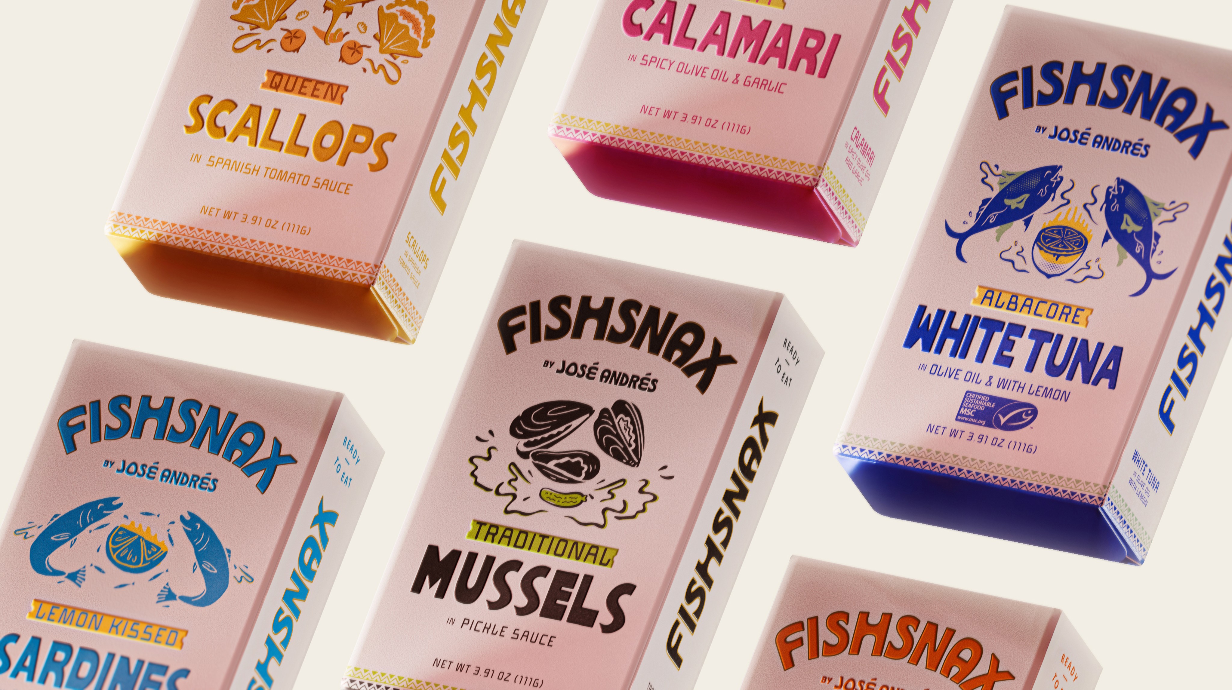
Fishsnax is a premium tinned seafood brand by Chef Jose Andres that reimagines canned fish as a snackable, fun and culturally relevant product rather than a pantry afterthought.

ASSIGNMENT

Fishsnax set out to connect with a younger, visually driven audience leading the modern tinned-fish revival while still carrying the authority of world-renowned chef José Andrés. The goal was to create a bold, expressive brand system that could balance contemporary relevance with culinary credibility, and scale across a growing product range including three new launches.

CHALLENGE

The key challenge was balance: how to honor José Andrés’ voice and reputation without overpowering or alienating a new generation of consumers. Visually, the team needed to avoid inconsistency in a digital-first landscape by establishing clear constraints — a system that felt cohesive, distinctive, and adaptable. The brand also needed meaningful ways to engage audiences beyond the packaging itself.

SOLUTIONS

The identity was built around illustration-led packaging inspired by traditional block-printing and risograph techniques. Limited color palettes and intentional imperfections created warmth, energy, and a cohesive visual language. To extend the artwork beyond pack, limited-edition temporary tattoos were introduced at launches and events, adding playfulness, collectability, and cultural depth while reinforcing a brand that feels confident, human, and chef-led.

Batch.Works product catalogue book on a work top with a graphic printed image on the front

“A nice shift from traditional tinned-anything where they are usually packed to the brim with color.”

“A nice shift from traditional tinned-anything where they are usually packed to the brim with color.”

“A nice shift from traditional tinned-anything where they are usually packed to the brim with color.”

BrandNew

BrandNew

BrandNew

Batch.Works product catalogue book on a work top with a graphic printed image on the front
Streetside billboard with flyposters of the Batch.Works brand and illustrations
Batch.Works product catalogue book on a work top with a graphic printed image on the front
Streetside billboard with flyposters of the Batch.Works brand and illustrations

TEAM

Design Director: Zeki Michael Keskin / Product Visuals: Gabriel Cellini, Simay Yaman/ Motion: Mali Uzen/ Product Photography: Sophie Macaluso/ Jose Andres Group: Kendall Tamny, Pere Selles/ Gourmet Foods International: Brian Scott, Brewster Mccall, Kim Chesser

TEAM

Design Director: Zeki Michael Keskin / Product Visuals: Gabriel Cellini, Simay Yaman/ Motion: Mali Uzen/ Product Photography: Sophie Macaluso/ Jose Andres Group: Kendall Tamny, Pere Selles/ Gourmet Foods International: Brian Scott, Brewster Mccall, Kim Chesser

TEAM

Design Director: Zeki Michael Keskin / Product Visuals: Gabriel Cellini, Simay Yaman/ Motion: Mali Uzen/ Product Photography: Sophie Macaluso/ Jose Andres Group: Kendall Tamny, Pere Selles/ Gourmet Foods International: Brian Scott, Brewster Mccall, Kim Chesser