2025
JOSE ANDRES FOODS
Branding
,
Design Strategy
,
Packaging Design
for
José Andrés Foods
for
José Andrés Foods


About
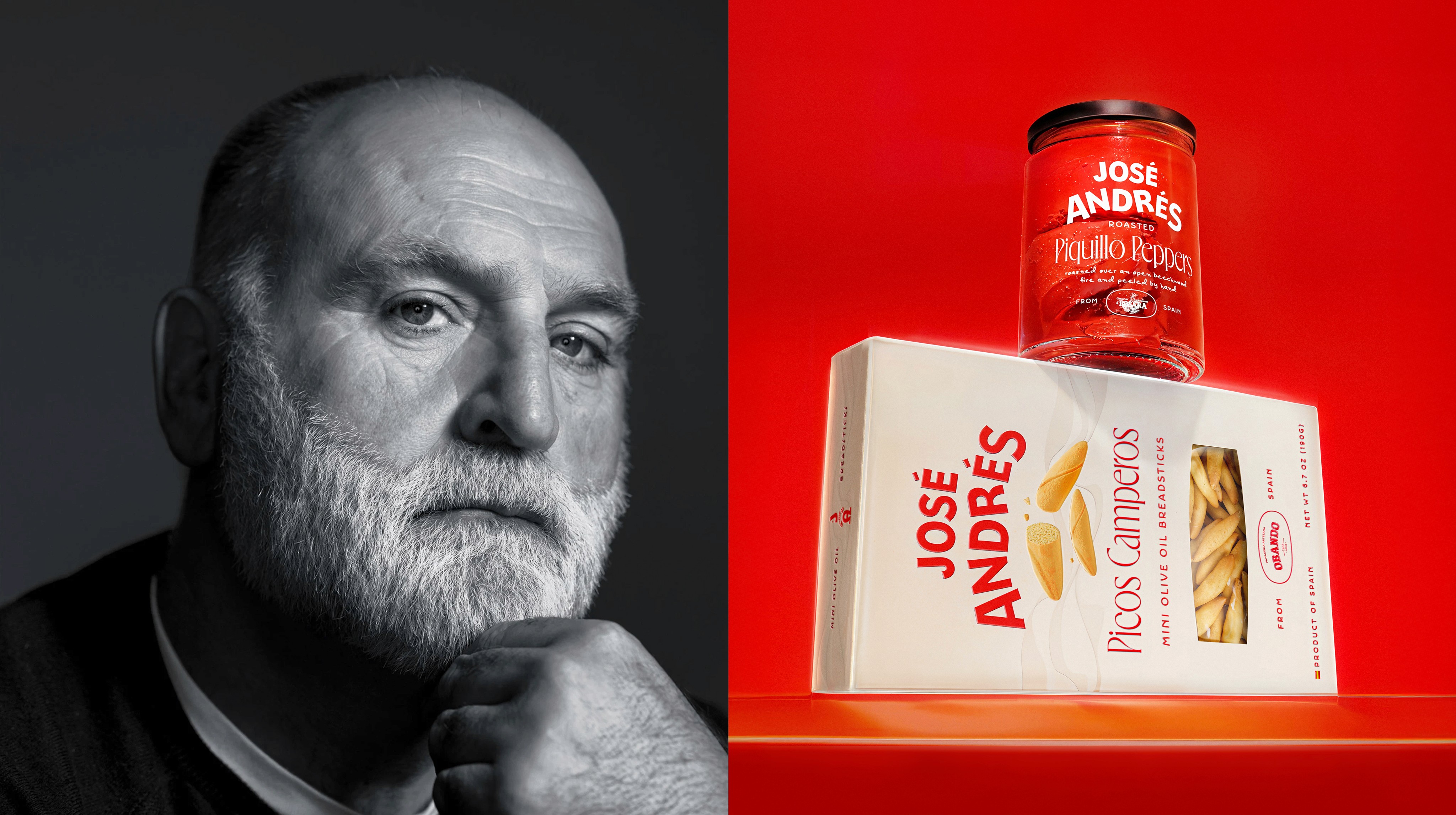
We were honored to work on a rebrand that brings celebrated chef and humanitarian José Andrés’ passion for Spanish cuisine to life through design. Embracing José’s boundless energy and his brand's global ambitions, we crafted a design system that is proudly Spanish – while clearly resonating with the U.S. audience.
ASSIGNMENT
We were asked to craft a fresh, new brand system that transforms José Andrés Foods into a cohesive and compelling brand, that reflects the celebrity chef’s vibrant and adventurous personality, while solving internal company conflicts and understanding operational dynamics.
ASSIGNMENT
We were asked to craft a fresh, new brand system that transforms José Andrés Foods into a cohesive and compelling brand, that reflects the celebrity chef’s vibrant and adventurous personality, while solving internal company conflicts and understanding operational dynamics.
ASSIGNMENT
We were asked to craft a fresh, new brand system that transforms José Andrés Foods into a cohesive and compelling brand, that reflects the celebrity chef’s vibrant and adventurous personality, while solving internal company conflicts and understanding operational dynamics.
CHALLENGE
Due to almost all products being manufactured in Spain and imported to the US, a few internal challanges were present. Working with 80+ SKU’s and over 40 vendors, layout conflicts, inconsistencies were hurting the brand. Also some of these manufacturing partners had their own respectable brands in the market and wanted their marks to be present on the packaging, eventually leading to brand hierarchy & communication conflicts. The more obvious challenge in this project was reflecting Jose’s vibrant and adventurous personality, and communicating his love for food, something that was underestimated on the previous brand design. Through focusing on these challenges and with retail insights from Gourmet Foods International and Jose Andres Group we crafted solutions that carried the brand in to where it deserves to be.
SOLUTIONS
In the new identity we decided to honor partnerships as part of a proudly spanish theme connected deeply to Jose’s personality, to be real we highlighted transparent sourcing with a partner logo lock up on the front of the packaging, also the map of spain detail on the back of most SKU’s reflecting the story and what region this product comes from and why it’s and important Spanish item. The refreshed brand presence, taking reds and hues from vibrance of Jose’s quirky and adventurous restaraunts we ensured every detail tells a story of authenticity and realness.


“It feels like a Michelin-starred love letter to frozen food and proof that simplicity can be the sexiest garnish.”
–The Dieline
–The Dieline
–The Dieline


TEAM
Design Director: Zeki Michael Keskin / Motion: Mali Uzen/ Product Photography: Sophie Macaluso/ Portrait of Jose: Lexey Swall/ Team: Kendall Tamny, Pere Selles
TEAM
Design Director: Zeki Michael Keskin / Motion: Mali Uzen/ Product Photography: Sophie Macaluso/ Portrait of Jose: Lexey Swall/ Team: Kendall Tamny, Pere Selles
TEAM
Design Director: Zeki Michael Keskin / Motion: Mali Uzen/ Product Photography: Sophie Macaluso/ Portrait of Jose: Lexey Swall/ Team: Kendall Tamny, Pere Selles